What is Adaptive Web Design (RWD)?
Adaptive Web Design (RWD) approach is already existing long before Responsive Web Design (RWD) approach, AWD is solution to overcome cross-platform page design challenges. Because the mobile phone screen is vertical and the screen is small, the experience of using the computer (horizontal layout and large screen) cannot adapt to the browsing mode of the mobile phone, so an independent mobile version site was developed to allow users to use the mobile phone to browse the website normally. To determine whether it is an AWD page, you can check whether the URL starts with “m” or “mobile”, e.g. Facebook (https://m.facebook.com), Twitter (https://mobile.twitter.com/).
What is the difference between AWD and RWD web pages? Understand the advantages and disadvantages at once!
Another newer web technology that is easily confused with the AWD concept is RWD. Both AWD and RWD have quite proficient technologies. However, in comparison, the RWD web page cross-platform technology that has appeared recently, in addition to complementing some of the shortcomings of AWD, the development structure and development process are also different.
AWD and RWD features comparison table
| AWD | RWD | |
| Full Name | Adaptive Web Design | Responsive Web Design |
| Year existed | Long before | Recent decade, inspired by an American web designer in year 2010 |
| Domain name | Use both “www” and “m” for sub-domain | Only using “www” |
| Design flow approach | Mobile > Tablet > Desktop | Desktop > Tablet > Mobile |
| Web template files | All website templates files are stored into two folders for mobile and desktop versions respectively. All the HTML and CSS are also processed separately. | All template files, HTML and CSS are stored and processed at once. |
| Usage target | For giant websites such as portal, platform with system integration | Corporate website, landing page, branding website |
| SEO | Faster loading speed | Avoid content duplication and page navigation redundancy |
| Pros | Can have unique and standalone design for specified device. This to enhance user experience | Able browse pages seamlessly in different screen size without renavigating the page |
| Cons | Two sites must be developed and maintained at the same time, and the construction and follow-up maintenance costs are relatively high | During website designing stage, the changes and presentation of multiple device sizes on the same web page must be considered at once. Therefore the design challenge is relatively high. |
AWD and RWD difference comparison screen examples
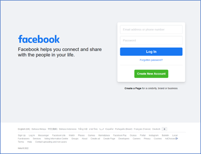
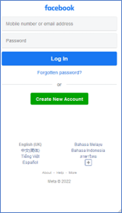
Facebook adopts AWD adaptive webpage (divided into mobile webpage and computer webpage), among which the mobile webpage (https://m.facebook.com/) will not automatically switch between the layout of mobile phones and computer devices.
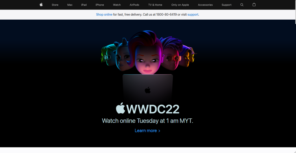
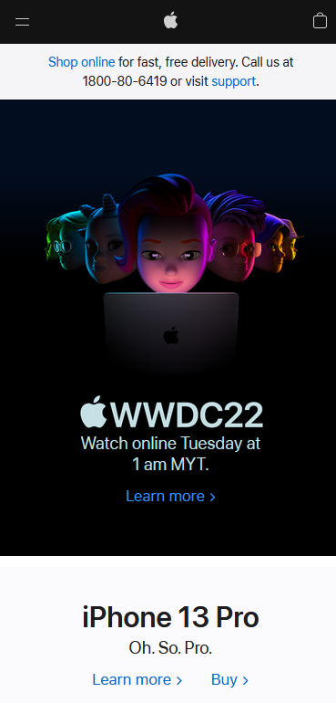
Apple‘s official website uses RWD responsive web technology (https://www.apple.com/my/) to automatically switch layouts on mobile phones and computer devices.
3 Tips on how to choose between AWD and RWD web pages
As the number of consumers using mobile devices has increased significantly, well-built mobile web pages and friendly browsing screens can improve user experience, thereby increasing consumers’ staying time and interaction rate. Should I choose AWD or RWD? The following provides 3 aspects to teach you to choose a suitable web design!
1. Based on website type
If your website is a corporate website, image website or brand website, it is recommended to use RWD for development. Mainly because this type of website does not focus on the use of mobile devices, and at the same time pays more attention to the image presented by the computer version, so the RWD development method is more suitable. If it is a large shopping mall or a mobile device system platform, the AWD method can be used for development, which is better designed for mobile device users and provides a better user experience.
2. Based on target audience
If your website has different user groups, different usage scenarios, or different user experiences on computers and mobile phones, using AWD can create an individually suitable software environment according to different user groups. And if it is a website that the public can access, the RWD with wider compatibility can better meet the needs of the public.
3. Based on budget
Since the AWD website needs to develop and maintain two websites at the same time, although they both capture the same content database, it will cost more for the pre-system development and subsequent website maintenance. Therefore, in terms of long-term operation, AWD is more suitable for development by the company’s internal team. If the website design and development is outsourced by a web design company, it is recommended to use the RWD method, and the future website maintenance work will be relatively simple.
Which is better for SEO, AWD or RWD pages?
In September 2020, Google has fully implemented the “mobile version content priority indexing”. As the name suggests, mobile version websites will become the basis for Google’s priority search and ranking. Which one is better for SEO, AWD or RWD web design? See our detailed comparison notes below.
Avoid content duplication
Since AWD uses two different URLs for the mobile version and the computer version, it is easy for Google to determine that it is a website with duplicate content. Therefore, the AWD website needs to indicate “the corresponding URL of the computer version” in the HTML of the mobile version. The website version and the mobile version are separated and included separately. And RWD is less of a problem in this regard because it is the same data content of the same website.
Reducing navigation redirection
Due to the different URLs of the mobile and computer versions of AWD, when switching devices, engineers usually adopt a “redirection” method to make the two versions of the website correspond to each other and automatically switch. But in SEO, fewer redirects are better. Fewer redirects can avoid leading to the wrong URL or infinite redirects, or making users wait too long, resulting in higher bounce rates.
Page loading speed
Recently, Google has put more weight on the algorithm of page loading speed and has continuously stated that page loading speed is one of the factors that determine the natural ranking and keyword advertising ranking. Since AWD’s development process is based on the mobile version’s user experience, HTML, JavaScript, and CSS can be customized for mobile devices, so that the mobile version of the website can get better page loading performance. In contrast, RWD must execute many cross-platform versions of HTML, JavaScript, and CSS on the same page, and the files are relatively large. Therefore, caching technology is often required to speed up page loading.
| SEO Scoring | AWD | RWD |
| Avoid content duplication | X | V |
| Reducing navigation redirection | X | V |
| Page loading speed | V | O |
AWD website common Q&A | How to distinguish from RWD
Q1. Generally, the company’s website recommends using AWD or RWD for production?
Since the company’s website usually pays more attention to the image and vision, and the users of the website are mostly browsed by computer web pages, it is recommended to use the RWD method for the construction of the website, so that the company’s website can achieve a better user experience.
Q2. Which one, AWD or RWD, is the mainstream cross-platform website design solution?
RWD is an improved cross-platform web technology for AWD. RWD can get better performance in website development, SEO performance, follow-up maintenance, and visual presentation. Therefore, almost all major web design companies use RWD as the main cross-platform website design solution.
Q3. Will adopting AWD have any impact on SEO?
AWD adopts a dual-site web page structure, and both “content duplication problem” and “web page redirection” will produce relatively unfavourable results for SEO. If AWD is to be adopted, it needs to have relative supporting measures in terms of SEO. Therefore, to facilitate SEO ranking, many websites have gradually switched to RWD for website construction in recent years.
Entertop is a web design company located in Malaysia. It has website design experience in various industries and can assist companies to enhance their online brand image and establish a good user experience. You can refer to the website cases we have designed through the website, such as: branding website, corporate website, customized website, RWD website design, etc., to confirm your needs and contact us through the website enquiry form, we will have someone liaise with you!
Category
Recent Post