7 Scenarios to Avoid Using Minimalist Design on Your Website
Minimalist design, characterized by its clean lines, simple color palettes, and lack of clutter, has become quite trendy in web design over recent years. This design approach emphasizes functionality and user experience by stripping away unnecessary elements, thereby allowing content to stand out. However, it’s not always the right choice for every project. In some cases, especially when a website aims to convey a lot of information or to engage users with a more immersive experience, more detailed and visually rich designs are better suited to meet user needs and expectations. These designs can incorporate diverse elements such as intricate graphics, vibrant colors, interactive features, and comprehensive layouts that provide a more engaging and informative user experience. Therefore, the choice between minimalist and detailed design should be carefully considered based on the specific goals and audience of the website.
Here are seven scenarios where you should avoid using a minimalist design on your website:
1. Complex Information Needs
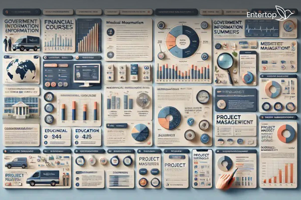
Minimalist design is often synonymous with simplicity and clarity, making it an attractive choice for many. However, if your website needs to present a large amount of detailed information—such as data, charts, and long articles—a minimalist design can make it challenging for users to find and comprehend all the content. In such cases, a more comprehensive design that allows for better organization and presentation of information is preferable. This type of design can include features like categorized sections, interactive elements, and detailed navigation menus that help users easily locate the information they need. Moreover, incorporating visual aids and summaries can further enhance the user experience by breaking down complex information into more digestible parts. Therefore, while minimalist design has its merits, it may not always be the best choice for content-heavy websites that require detailed and accessible information.
Examples of websites that require the presentation of complex information include:
- Financial Services Websites: Sites like Bloomberg or Yahoo Finance that provide detailed financial data, stock market information, and economic news.
- Educational Platforms: Websites like Coursera or Khan Academy that offer a wide range of courses, detailed lesson plans, and educational resources.
- Healthcare Portals: Websites like WebMD or Mayo Clinic that provide extensive medical information, research articles, and health resources.
- Government Websites: Sites like the U.S. Census Bureau or the UK’s Office for National Statistics that present detailed statistical data and reports.
- Project Management Tools: Websites like Jira or Asana that offer detailed project tracking, task management, and collaborative tools.
- Scientific Research Portals: Websites like PubMed or ResearchGate that provide access to a vast collection of research papers, data sets, and scholarly articles.
- E-commerce Marketplaces: Sites like Amazon or eBay that list a wide range of products with detailed descriptions, user reviews, and ratings.
2. Brand Identity
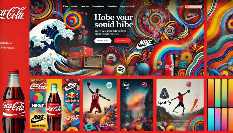
If your brand is vibrant, colorful, and dynamic, a minimalist design may not effectively convey your brand’s personality and energy. Brands that thrive on a lively and energetic vibe might find that minimalism falls short in communicating their unique identity. Such brands often rely on a design approach that uses bold colors, elaborate patterns, and dynamic visuals to truly represent their essence. By incorporating a diverse palette and intricate designs, you can ensure that your brand’s lively spirit is fully captured. Additionally, using dynamic visuals can help in creating an engaging experience for your audience, allowing them to connect with your brand on a deeper level. Therefore, opting for a design that embraces these elements will not only reflect your brand’s vibrancy but also enhance its appeal.
Examples of websites that effectively convey vibrant, colorful, and dynamic brand identities include:
- Coca-Cola: Known for its bold red color and dynamic visuals, the Coca-Cola website uses vibrant imagery and engaging content to reflect its lively brand personality.
- Nike: With its use of strong visuals, bold colors, and dynamic design elements, Nike’s website captures the energy and athleticism of its brand.
- Airbnb: The Airbnb website uses engaging visuals, vibrant colors, and a dynamic layout to convey a sense of adventure and community, aligning with its brand identity.
- Spotify: Spotify’s website features bold colors, dynamic graphics, and an engaging user interface that reflects its energetic and innovative brand.
- Red Bull: Red Bull’s website is filled with vibrant colors, action-packed visuals, and dynamic content that perfectly captures its adventurous and lively brand spirit.
3. E-commerce Sites
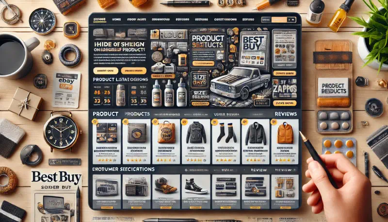
For online stores that offer a wide range of products, embracing minimalism in their design approach can create significant navigation challenges and may not showcase the products as effectively as needed. Detailed product descriptions, high-quality images, and user reviews are essential components for any successful e-commerce site. A minimalist design might not provide adequate space for these critical elements, which can result in a less informative and engaging user experience. By opting for a more detailed and comprehensive design, online stores can ensure better product display, improved user navigation, and a richer overall browsing experience for their customers. This approach allows for more information to be readily available, aiding customers in making informed purchasing decisions and ultimately enhancing their satisfaction with the site.
Examples of e-commerce websites that benefit from a more detailed and comprehensive design rather than a minimalist approach include:
- Amazon: With an extensive range of products, detailed product descriptions, user reviews, and high-quality images, Amazon’s design needs to facilitate easy navigation and comprehensive information display.
- eBay: Similar to Amazon, eBay offers a wide variety of products from different sellers. It requires a detailed design to showcase product listings, user feedback, and seller ratings effectively.
- Walmart: Walmart’s online store features a vast inventory that includes everything from groceries to electronics. A more detailed design helps in organizing these products and providing sufficient information for each.
- Best Buy: As a major electronics retailer, Best Buy’s website needs to provide detailed specifications, user reviews, and comparison features, which are better supported by a comprehensive design.
- Etsy: Etsy’s platform for handmade and vintage items benefits from detailed product descriptions, multiple images, and seller information, making a minimalist design less suitable.
- Wayfair: Specializing in home goods, Wayfair’s site requires detailed images, dimensions, and customer reviews for each product, necessitating a more elaborate design.
- Zappos: As a retailer of shoes and clothing, Zappos benefits from detailed product images, extensive reviews, and size guides, which are critical for customer satisfaction and are better served by a detailed design approach.
4. Audience Preferences
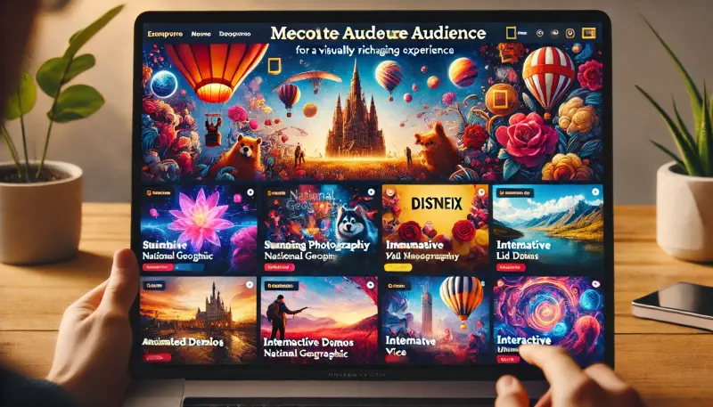
Understanding your target audience is crucial for the success of any design or marketing strategy. If your audience prefers a more visually rich and engaging experience, a minimalist design might seem too plain and uninteresting to them. It’s important to conduct thorough user research to understand their preferences, behaviors, and expectations. This research will provide valuable insights that can inform your design choices and ensure that your audience remains engaged and satisfied with your content. Tailoring your approach based on this understanding can lead to higher levels of user interaction and overall success.
Examples of websites that cater to audience preferences for a more visually rich and engaging experience, rather than a minimalist design, include:
- BuzzFeed: Known for its vibrant, dynamic content, BuzzFeed uses bold colors, engaging visuals, and interactive elements to capture the attention of its audience.
- Disney: Disney’s website is filled with rich visuals, animations, and interactive features that create an immersive experience for fans of all ages.
- National Geographic: Featuring stunning photography, detailed maps, and engaging storytelling, National Geographic’s website offers a visually rich experience that appeals to its audience.
- Netflix: The Netflix platform uses bold imagery, vibrant colors, and dynamic layouts to engage users and showcase its wide array of content.
- Complex: Complex’s website combines bold visuals, animated elements, and rich media to engage its audience, particularly those interested in pop culture and lifestyle content.
- Adobe: Adobe’s website showcases its creative tools through detailed visuals, interactive demos, and rich media content that appeal to its artistically inclined audience.
- VICE: VICE’s website employs bold, dynamic visuals and engaging multimedia content to resonate with its audience, who seek edgy and in-depth journalism.
These websites illustrate how a detailed and visually engaging design can effectively meet the preferences and expectations of their target audiences.
5. Interactive Elements
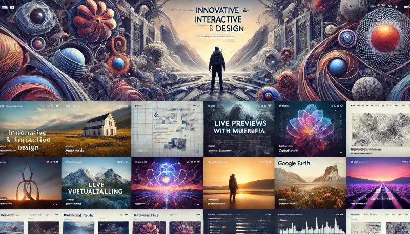
Websites that rely heavily on interactive elements, such as games or multimedia experiences, may require more complex and intricate designs to effectively enhance user engagement and provide a richer experience. Minimalist design, while often visually appealing and easy to navigate, may not provide the necessary depth and interactivity needed for such advanced features. A more elaborate and thoughtfully crafted design can offer a better user experience by incorporating dynamic and engaging interactive elements, which in turn can make the website more appealing and enjoyable to use. These interactive elements might include animations, responsive interfaces, and engaging multimedia content that cater to the expectations of users seeking a more immersive and interactive online experience.
Examples of websites that rely heavily on interactive elements and benefit from more complex and intricate designs include:
- Awwwards: Showcases innovative and interactive web designs, providing a platform for designers to display their work with engaging animations and interfaces.
- CodePen: An interactive development environment for front-end designers and developers, featuring live previews and dynamic coding tools.
- Patagonia: Offers an immersive storytelling experience with rich multimedia content, including interactive maps and videos about their environmental initiatives.
- Google Arts & Culture: Provides virtual tours of museums and interactive art experiences, allowing users to explore detailed and engaging visual content.
- Spotify: Features interactive playlists, dynamic visualizations, and personalized user interfaces that enhance the music streaming experience.
- BBC Earth: Engages users with interactive documentaries, rich graphics, and animated storytelling elements about wildlife and nature.
- National Geographic: Combines stunning photography, interactive maps, and engaging multimedia to create an immersive educational experience for users.
These websites use detailed and elaborate designs to create rich, engaging, and interactive user experiences, making them more appealing and enjoyable for their audiences.
6. Detailed Visual Storytelling
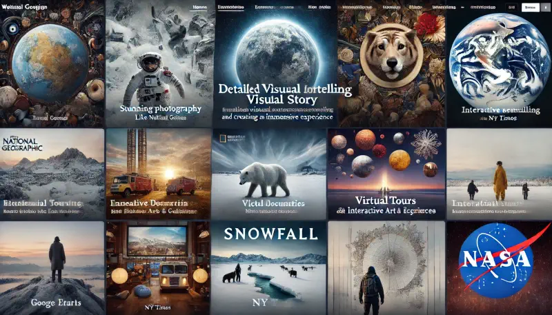
If your website aims to tell a detailed visual story or create an immersive experience, minimalist design might not provide enough depth and detail. Storytelling often requires a rich visual language that includes various elements like images, videos, and animations. Incorporating these elements allows you to convey emotions, set the scene, and draw the audience deeper into the narrative. A more detailed design approach can help in creating a captivating narrative by providing layers of context and enhancing the overall engagement. Additionally, a well-crafted visual story can leave a lasting impression on your audience, making your website more memorable and impactful.
Examples of websites that excel in detailed visual storytelling and benefit from more elaborate designs include:
- National Geographic: Known for its stunning photography and immersive multimedia content, National Geographic’s website effectively tells visual stories about nature, wildlife, and cultures around the world.
- NY Times – The Upshot: The New York Times’ Upshot section uses detailed graphics, interactive elements, and in-depth articles to tell complex stories about politics, economics, and society.
- Patagonia: Patagonia’s website uses rich multimedia content, including videos and interactive elements, to narrate its environmental initiatives and brand story.
- BBC Earth: BBC Earth’s website features engaging documentaries, interactive maps, and rich visuals to create an immersive storytelling experience about wildlife and natural history.
- Google Arts & Culture: This platform provides virtual tours of museums and offers interactive art experiences, allowing users to explore detailed visual stories about art and culture.
- Snowfall by NY Times: An iconic example of multimedia storytelling, “Snowfall” by The New York Times combines text, video, graphics, and animations to create an immersive narrative about an avalanche.
- NASA: NASA’s website uses detailed images, interactive simulations, and engaging videos to tell stories about space exploration and scientific discoveries.
These websites use rich visuals and interactive elements to create compelling and memorable storytelling experiences, making them more engaging for their audiences.
7. Cultural Context
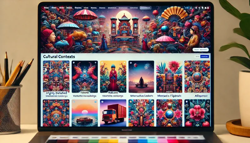
In some cultural contexts, minimalism might be seen as too sparse or lacking warmth, leading to a perception that it is cold or uninviting. Different cultures have different aesthetic preferences, and what works in one context may not work in another due to these varying tastes. For instance, while minimalism emphasizes simplicity and the use of space, a more elaborate design might be preferred in cultures that value richness, complexity, and detail, as it can convey a sense of abundance and depth. This preference for detailed and ornate designs might be rooted in historical, social, or even psychological factors unique to each culture, highlighting the diversity in human expression and appreciation for art and design.
Examples of websites that might benefit from a more elaborate and detailed design due to cultural context include:
- Taobao: As one of China’s largest e-commerce platforms, Taobao features a highly detailed and colorful design to appeal to local shopping preferences.
- Rakuten: This Japanese e-commerce site uses vibrant colors, detailed product listings, and rich media to cater to Japanese consumers who prefer visually rich experiences.
- Zalora: Operating in Southeast Asia, Zalora’s website includes detailed product images, elaborate layouts, and vibrant visuals to match the region’s aesthetic preferences.
- Jumia: Serving multiple African countries, Jumia incorporates detailed designs and a variety of interactive elements to engage users who prefer a richer visual experience.
- Flipkart: One of India’s leading online shopping platforms, Flipkart uses a detailed and colorful design to cater to Indian consumers who appreciate vibrant and elaborate visuals.
- Mercado Libre: This major e-commerce site in Latin America employs a detailed design approach to meet the diverse cultural expectations of its users in the region.
- AliExpress: Serving a global audience but particularly popular in countries with a preference for richer designs, AliExpress uses a detailed and colorful approach to engage its users.
These websites leverage more elaborate and colorful designs to align with the cultural preferences and aesthetic tastes of their target audiences.
In conclusion, while minimalist design has its merits, it is not a one-size-fits-all solution. Understanding the context and specific needs of your website can guide you in choosing a design approach that is both effective and appealing to your users.
Tags:
Category
Recent Post